Layout
Each action appears in the OliveTin web interface as a button card. The screenshot below shows three buttons in different states so you can see each part of the layout.
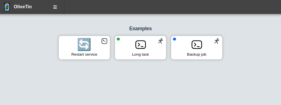
Action title
The title comes from the action’s title field in config.yaml. It is shown at the bottom of the button and is also used as the tooltip when you hover over the button.
Icon
The large glyph in the centre of the button is the action icon. You set this with the icon field on the action.
If you do not set icon, OliveTin uses the default action icon. See Icons for Unicode, Iconify, and image options.
On-click indicator
The small icon in the top-right corner of the button is the on-click indicator. It shows what happens when the action starts — for example, opening an execution dialog, an argument form, or action history.
The indicator is controlled by the action’s onclick setting (legacy name: popupOnStart). See Execute on click for the available options.
You can hide these indicators globally with showNavigateOnStartIcons: false in config.yaml.
Running and queued indicators
When an action is already running or waiting in a queue, OliveTin shows a small circle in the top-left corner of the button:
-
Green — the action has a running execution
-
Blue — the action has an execution waiting in a queue
These indicators appear when concurrency or action groups limit how many executions can run at once. They disappear when the execution finishes.
In the screenshot above, Long task is running and Backup job is queued.